When it comes to decorating your home, furniture placement can make or break the functionality and aesthetic appeal of a room. We’ve all been there—arranging furniture only to find that the room feels cramped, the flow is awkward, or the space just doesn’t look right. The good news is that these common mistakes are easy to fix with a bit of insight and planning. In this article, we’ll explore some of the most common furniture placement fails and offer practical tips to help you create a well-balanced, comfortable, and stylish space.
Mistake #1: Pushing Furniture Against the Walls
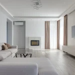
One of the most common furniture placement mistakes is pushing all the furniture against the walls. While this might seem like a logical way to maximize space, it can actually make the room feel less inviting and more like a waiting room.
Bobby Berk, a respected interior designer, points out, “Pushing furniture against walls is a common mistake. Create a sense of flow and intimacy by floating pieces in the room.” By pulling your furniture away from the walls, you create more conversational areas and a sense of coziness. For example, try positioning your sofa in the middle of the room with a console table behind it. This not only breaks up the space but also allows for better traffic flow around the room.
When we moved into our current home, I made the mistake of lining all the furniture against the walls in our living room. It felt sparse and disconnected. After some trial and error, I decided to float the sofa in the center of the room and added a couple of armchairs facing it. This arrangement created a much more inviting space, perfect for conversation and relaxing as a family.
Mistake #2: Ignoring the Room’s Focal Point
Every room should have a focal point—a feature that draws the eye and anchors the space. Whether it’s a fireplace, a large window with a beautiful view, or a piece of artwork, arranging your furniture to highlight this focal point can make the room feel more cohesive.
Joanna Gaines, known for her warm and inviting design style, advises, “Consider the room’s natural focal point and arrange furniture to enhance it. This could be a fireplace, window, or piece of art.” For instance, if you have a fireplace, arrange your seating around it to make it the centerpiece of the room. If your focal point is a window, consider positioning your furniture so that it takes full advantage of the natural light and view.
In our family room, the large windows that overlook the backyard are the natural focal point. Initially, I had our sofa facing away from the windows, which felt like a missed opportunity. After rearranging the furniture to face the windows, the room instantly felt brighter and more connected to the outdoors.
Mistake #3: Overcrowding the Room with Furniture
Another common mistake is overcrowding the room with too much furniture. While it’s tempting to fill every corner with a piece of furniture, this can lead to a cluttered and cramped space that’s difficult to navigate.
Hilary Farr, an expert in functional and stylish design, reminds us, “Consider the scale of your furniture about the room size. Oversized pieces can overwhelm a small space.” To avoid this mistake, carefully consider the scale of each piece relative to the size of the room. In smaller spaces, opt for furniture with a smaller footprint and consider multifunctional pieces, like an ottoman that doubles as storage.
When we first moved into our small apartment, we made the mistake of trying to fit a large sectional sofa into the living room. It dominated the space and left little room for anything else. We eventually swapped it out for a more appropriately sized loveseat and a couple of smaller chairs, which opened up the room and made it feel much more spacious.
Mistake #4: Forgetting About Traffic Flow
Good traffic flow is essential in any room. Furniture should be arranged in a way that allows people to move easily from one area to another without having to navigate an obstacle course.
Nate Berkus, known for his thoughtful and practical designs, emphasizes, “Balance form and function. A room should look beautiful but also be comfortable and practical for everyday living.” Make sure there is enough space between furniture pieces so that people can move around comfortably. Ideally, there should be at least two to three feet of walking space between furniture.
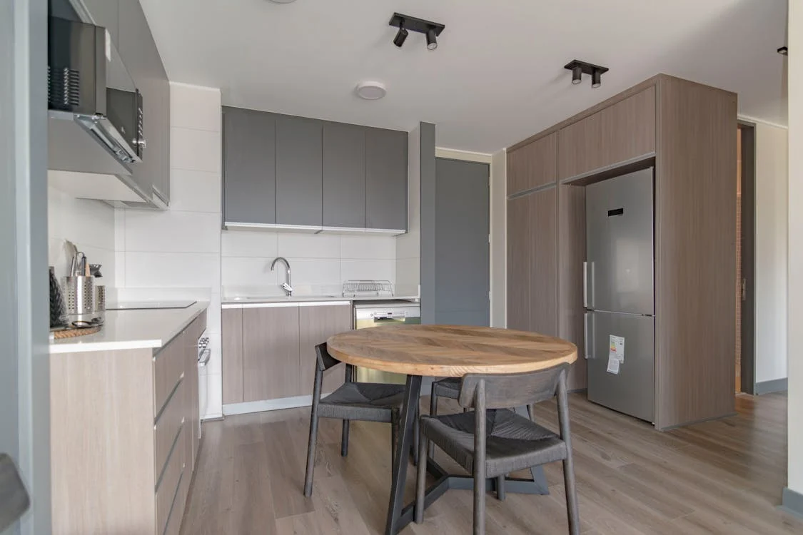
In our dining room, we initially had the table too close to the wall, making it difficult to pull out chairs and walk around. Moving the table a few feet toward the center of the room, it not only improved the flow but also made the room feel more balanced and functional.
Mistake #5: Overlooking the Importance of Lighting
Lighting is often an afterthought in furniture placement, but it plays a crucial role in how a room feels. Poor lighting can make even the best furniture arrangement look flat and uninviting.
Emily Henderson, an interior designer known for her expertise in lighting, suggests, “Experiment with different layouts to find the perfect arrangement. Don’t be afraid to rearrange furniture until you achieve the desired look.” Additionally, use a mix of lighting sources, including overhead lights, floor lamps, and table lamps, to create a well-lit, layered space.
In our living room, we originally relied solely on an overhead light, which cast harsh shadows and didn’t do much to create ambiance. After adding a couple of floor lamps and some strategically placed table lamps, the room felt much warmer and more inviting.
Mistake #6: Not Mixing and Matching Styles
Sticking to one style of furniture can lead to a room that feels too matchy-matchy and lacks personality. On the other hand, mixing and matching different styles can add depth and interest to your space.
Kelly Wearstler, a designer known for her bold and eclectic style, advises, “Don’t be afraid to mix and match furniture styles. A well-curated eclectic look can be both stylish and functional.” To successfully mix styles, choose pieces that have something in common, like color, scale, or material, to create a cohesive look.
For example, in our home, I’ve paired a modern sofa with a vintage coffee table and a couple of mid-century armchairs. While the pieces are from different eras, they share a similar color palette and wood tones, which ties them together and makes the room feel curated rather than chaotic.
Mistake #7: Ignoring Functionality
While aesthetics are important, the functionality of your furniture placement should never be overlooked. A room can be beautifully designed, but if it doesn’t meet your daily needs, it won’t be a successful space.
Nate Berkus reminds us, “Balance form and function.” For example, if you love to entertain, make sure there’s enough seating for guests and that the furniture is arranged in a way that facilitates conversation. If you have kids, consider furniture placement that allows for plenty of play space while still maintaining order.
In our family room, we made sure to leave plenty of open space in the center of the room for the kids to play. We arranged the seating around the perimeter, which kept the room open and flexible for different activities.
Mistake #8: Neglecting Personal Style
Finally, one of the biggest mistakes in furniture placement is neglecting your personal style. While it’s important to consider design principles, your home should ultimately reflect who you are and how you live.
When we first decorated our home, I was so focused on following the “rules” of interior design that I forgot to include pieces that really reflected our family’s personality. Over time, I started incorporating more personal touches, like family photos, travel souvenirs, and artwork we love. The result is a space that feels uniquely ours, full of memories and items that bring us joy.
Conclusion: Finding Your Perfect Furniture Placement
Avoiding common furniture placement mistakes can transform your space from awkward and uncomfortable to stylish and functional. Whether it’s floating furniture away from walls, highlighting a room’s focal point, or ensuring there’s enough space for traffic flow, small changes can have a big impact.
As Joanna Gaines advises, “Consider the room’s natural focal point,” and as Bobby Berk says, “Create a sense of flow.” Keep these tips in mind, but don’t forget to inject your personal style into your space. After all, your home should be a reflection of you.
So, take a fresh look at your living spaces. Move things around, experiment with different layouts, and don’t be afraid to break a few “rules” to create a home that works for you and your family. With a bit of thought and creativity, you can avoid these common furniture placement fails and create a space that’s both beautiful and functional.


